3 June 2011

XML excercise

XML is a code highly reminiscent of CSS as both are used to style text and images that are placed within tags. Using this method for commercial design could be incredibly time saving, as all things that are tagged will automatically have a style attached to it. This would probably be most beneficial for direct mail campaigns and large scale layouts, catalogues for example.

Process


Original document
This shows how you can individually map tags to styles. Alternatively, if the tags and styles share exactly the same name then you can choose map by name instead.

This image shows the mapped tags. When you highlight text you can see what tag and therefore what style that is linked to allowing quick and easy changes.
This shows the paragraph styles pallette. From here you can make changes to the style of the tagged (style name) text.


These are the final, adjusted documents, excuse the design.

dissertation feedback

This was a difficult period. The dreaded dissertation results. Needless to say my knees were a quivering and my palms were most definitely sweaty! So, this is what I got.

Tutor Comment:

Good attempt to apply phenomenology to the study of skateboarding. Partial and somewhat limited use of Merleau-Ponty - this would have further opened-up the topic.


A good problematisation of the fusion of boarding and phenomenology; argues for experiential themes and identifies sociological elements.
Over-reliant on Brymer

A few more illustrations would be welcome.

Not bad so far. What did I get?


A 2.1! Yes! I'm happy

brief 5 - the big idea

Whimsical! A not so spontaneous outburst there. This brief saw us being given a selection of words, of which we had to choose a solitary one and then develop an outcome with that word as its basis. Confused yet? So, out of my list of words the only one I had any excitement about was whimsical. Therefore, I ran with that.

Researching the word whimsical is surprisingly difficult, you don't tend to get many enjoyable result. You get several web sites that offer the definition and then countless businesses that have named themselves whimsical (insert business type here). As a tip, if you are in the same situation and you do Google 'whimsical' expecting mountains of bizarre and enthralling creations think again. The main saviour of this researching slump was Twitter. I found bucket fulls of weird and wacky web sites, blogs, videos and creations. One of which being yarn bombing, check it out, it's crazy.

After my research came the research presentation, where I exhibited what I had found. One necessary part to the presentation was to identify a loose target audience. It was this that, pretty much, gave me my concept. An audience I felt would be enjoyable was serious people who lack any form of whimsy. From this came the concept of taking these mundane individuals and making them come across as full of whimsy.

The outcome was to be based on the situation you find yourself in when you have a pen and a picture of a celebrity (or anyone for that matter) and you doodle over their face, blacking out teeth, adding devil horns and the such. From this sprouted the idea of fridge magnets, in the same vain as magnetic poetry and letters. I felt this concept was strong as it presented whimsy in a couple of ways. Firstly, taking boring objects (fridge, photos of boring people) and making them whimsical. Secondly, you encourage whimsy within yourself as you are using your imagination to create something bizarre and oddly beautiful. At this point I was under the illusion that the magnets alone didn't have enough context. To rectify this I created postcards, that would be put with the magnets, to explain what the magnets were for. Additionally, I made a box to house all of the elements. This box is intentionally meant to seem mundane because the content inside should speak for itself and explode to life. Consider a Pandora's box of whimsy.

I am very pleased with how it came out in the end. I feel that the quality is there, the idea is strong and, as childish as it is, they are very fun to play with.


brief 4 - ssp

The student set project was, for me, one of the more challenging. It was a struggle to pin point a concept from such vagueness. The idea with this brief is that we could pretty much do anything, pick a topic we were passionate about and go for it. After some contemplation and soul searching I decided that I hate papyrus (the typeface). I have always loathed its overuse and misuse, it is honestly the go to font for anyone without a remote clue.

Having identified the main problem with papyrus, it has no real personality and looks severely dated, it was decided that I would create a book which would instill the personalities of celebrities into papyrus in an attempt to make it more exciting and usable. I was pleased with the concept but, unfortunately, not with the execution. Due to time restrictions and not getting the concept until the last minute the book appears rushed. Well, see what you think.


Module Feedback

brief 3 - competitions

As the title suggest this module centered around competition briefs. The briefs were courtesy of Penguin and Puffin book cover designs, YCN and D&AD.

Penguin and Puffin

100 Years of Solitude and James and the Giant Peach comprised the subjects of the brief for Penguin and Puffin respectively. The Penguin brief provided the most challenging in this group as I had never encountered the novel before. However, I tried my best to learn about the story. How well that worked is anyone's guess. Anyway, to provide a solution I focused on an aspect of the book that intrigued me the most. A part where thousands of workers are massacred and thrown into the sea, after which the area where the book is set battles with torrential rain and flooding.


James and the Giant Peach was much more fun to do as I already had a knowledge of the story. For this outcome I wanted to stay away from the cliché of actually having a peach on the cover. Instead I applied a typographic style to represent the peach. Additionally, I hinted at the friends James gains in the story (insects) with shadows on the lettering. Seagulls are also seen to be carrying the different elements as reference to the narrative.


YCN

The brief I chose from the YCN selection was for Whyte and Mackay and their brand of whiskey liqueur, Glayva. I enjoyed this brief, especially the tasting session we had as a group. I had never seen this product before let alone tasted it so I felt that I could help to bring it to the target market the brand desired. The concept focused around the meaning of Glayva (very good) and how people say very good. The campaign consisted of posters, billboards and beer mats. 


D&AD

Out of the options provided I chose the Arjowiggins brief. The task was to create a viral campaign that would promote the company's blank sheet project to designers the world over. My concept was to create a range of videos based around a designer that showed him generating ideas in unconventional ways using a single blank sheet of paper.


Module Feedback

brief 2 - creative meaning


This is still one of my favourite briefs from the year. We were tasked to choose a random, innocuous, ordinary object and make it extraordinary. Initially, I felt that the task would be insanely difficult. As I worked through it, however, I found it to be interesting and engaging.

The object I chose to make extraordinary was an Xbox 360 controller, an object that I use quite often (after my work has been completed of course). As with every other brief, it all began with research. How big was the item? What are its features? What colours does it contain? These among many more questions were asked; including the amount of usage it gets, where it moves to and how it moves throughout the space it occupies, how it is held, comparisons to similar devices etc. To acquire the answers necessary for these questions I got may hands dirty and brought out the tape measure. Other aspects, such as emotion were investigated via questionnaires.

After I had procured the necessary knowledge I began thinking of ways to implement what I knew of the gadget to an outcome the what show it in a brand new light. Photos were taken of the controller and following their review it became apparent that the device resembled an alien space ship. This was an aspect that interested me greatly. As did the them of control, how the object had a strange hold on the user.

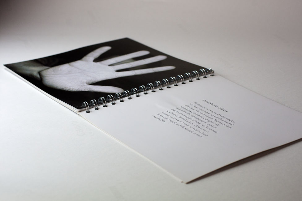
These themes led me to developing the concept of the Xbox controller being an alien craft that had crash landed on earth. From here I began to create a narrative for the piece. I decided on the outcome being in the style of a Government dossier that documented the arrival of the “alien craft” and the subsequent investigation of its purpose and the effect it had on those surrounding it.

A book was the format chosen to present the article. A combination of black and white, manipulated images, illustrations and text were chosen to display the “findings”. The house style of the document was fairly linear and unyielding to convey the sense of an official document. Black and white where the predominant colours used with splashes of colour to communicate specific details and for style. I feel that one of the greatest successes of this piece was the writing. It was quite tongue in cheek and witty (relevant, considering the subject matter), yet sophisticated enough to continue the document theme.

To conclude, this is a piece I am particularly proud of (in fact it is the outcome I am taking forward to the degree exhibition). I was pleased with the result for this module and helped to cement it as a personal favourite.


Module Feedback


brief 1 - real world

This brief was interesting, if not slightly bizarre and confusing. The brief was centered around Cardiff Airport (which even resulted in a class trip...how very primary school). The project was enjoyable after arriving at a suitable concept, however getting to that point was quite difficult.

The class was split into groups to begin with. Then we were provided with the brief...ish. It was difficult to ascertain what exactly we were meant to be designing, regardless we soldiered on and realised that it was all about the customer experience.

Our final concept was to provide users with an abstract view of Wales using a house style comprising of intricate triangular patterns, authentic materials and immersive interactive aspects. For final visuals we created renders of key areas of the arrivals process and created a model to show how the refurbished arrivals lounge would look.

The culmination of the project was a 20 minute presentation with your group in front of our peers, lecturers, all of the design agency mentors we were assigned as well as representatives from the airport itself.

The best part about this brief, personally, was meeting our group's mentor Alex from Burning Red. They are an excellent and friendly little company from the bay area.


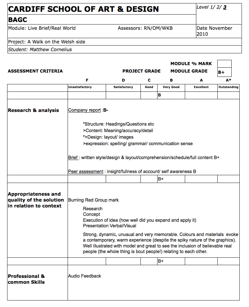
Module feedback