This is still one of my favourite briefs from the year. We were tasked to choose a random, innocuous, ordinary object and make it extraordinary. Initially, I felt that the task would be insanely difficult. As I worked through it, however, I found it to be interesting and engaging.
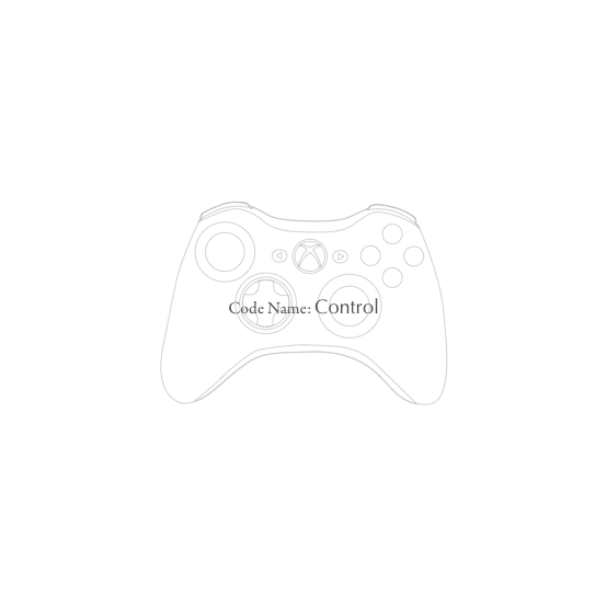
The object I chose to make extraordinary was an Xbox 360 controller, an object that I use quite often (after my work has been completed of course). As with every other brief, it all began with research. How big was the item? What are its features? What colours does it contain? These among many more questions were asked; including the amount of usage it gets, where it moves to and how it moves throughout the space it occupies, how it is held, comparisons to similar devices etc. To acquire the answers necessary for these questions I got may hands dirty and brought out the tape measure. Other aspects, such as emotion were investigated via questionnaires.
After I had procured the necessary knowledge I began thinking of ways to implement what I knew of the gadget to an outcome the what show it in a brand new light. Photos were taken of the controller and following their review it became apparent that the device resembled an alien space ship. This was an aspect that interested me greatly. As did the them of control, how the object had a strange hold on the user.
These themes led me to developing the concept of the Xbox controller being an alien craft that had crash landed on earth. From here I began to create a narrative for the piece. I decided on the outcome being in the style of a Government dossier that documented the arrival of the “alien craft” and the subsequent investigation of its purpose and the effect it had on those surrounding it.
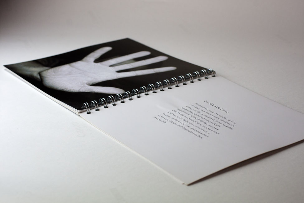
A book was the format chosen to present the article. A combination of black and white, manipulated images, illustrations and text were chosen to display the “findings”. The house style of the document was fairly linear and unyielding to convey the sense of an official document. Black and white where the predominant colours used with splashes of colour to communicate specific details and for style. I feel that one of the greatest successes of this piece was the writing. It was quite tongue in cheek and witty (relevant, considering the subject matter), yet sophisticated enough to continue the document theme.
To conclude, this is a piece I am particularly proud of (in fact it is the outcome I am taking forward to the degree exhibition). I was pleased with the result for this module and helped to cement it as a personal favourite.


Module Feedback

No comments:
Post a Comment